 Blackletter is the technical name of the first fonts used in book printing. Early printers like Gutenberg naturally replicated the latest available fonts, which in the 15th century were late medieval forms. See, for example, the Gutenberg Bible at the Library of Congress. Blackletters are the typographic equivalent of Gothic architecture and they correspond to the style's international spread. They were used longer in Germany and are hence associated with German books. Blackletters vary greatly but are divided into four basic categories, textura, fraktur, bastarda and rotunda. They are commonly distinguished by the forms of the lower case "o." Robert Bringhurst describes their differences as follows (and illustrated above):
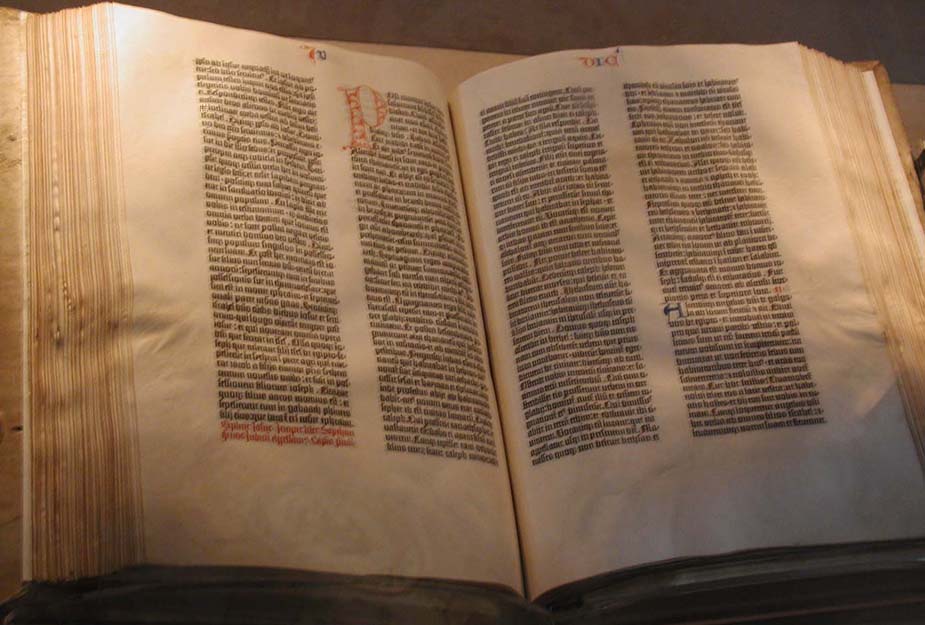
"Though written with only two penstrokes, the o in textura looks essentiall hexagonal. In a fraktur, it is normally flat on the left side, curved on the right. In a bastarda, it is normally pointed at top and bottom and belled on both sides. In a rotunda, it is essentially oval or round." The Elements of Typographic Style, version 3.1 (2005) p. 266.
Bringhurst gives a few examples of modern blackletter typefaces. Chairvaux was designed by Herbert Maring in 1990, based on the Cistercian abbey of Clairvaux, founded by St. Bernard in 1115. Fette Fraktur is a heavy, Romantic font designed in Frankfurt about 1850. Goody Text was designed by Frederic Goudy and issued by Monotype in 1928.
Uncial is the other prominent type of medieval script. Uncial is a lower case used by scribes from the 4th to the 9th centuries. The script was abandoned during the late medieval period and rediscovered in the 19th century by antiquarians. Due to their pre-Gothic origin, they came to represent a Romantic, early Middle Ages and captured the imagination of the early 20th century.
No comments:
Post a Comment